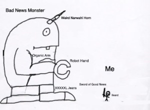
Bad News Monster

Art by Joel Bradley

I am currently one of the DJs at Home.fm and I am required to do a three-hour show every day of the week except for weekends. This means that I am responsible for coming up with 15 breaks that all have interesting, engaging content each day. In order to find this content I cycle through news stories and what I’ve learned through this experience is that news outlets love to focus specifically on bad news. Often times it is quite discouraging to sift through stories on drugs, violence, sex and crime on a daily basis.

For this reason I like to dig as deep as I can to find all the good news in the world so that I can share it with others to help them realize the world is a little bit better than they make think. This is not as easy as it may sound, and often I like to imagine that all of the bad news stories are one giant monster that I have to fight with my legendary sword of good news. I provided an extremely detailed and well-illustrated diagram below so you can see the epic battle first hand.

At the end of the day I want to believe I caused one person to smile or realize that there is good in the world. This is not an easy feat as the bad news monster lives to crush the people who fight it, but if good news continues to spread, the beast is not too hard to overcome. See illustration below.

I have had many people tell me that talking about nothing but good news makes people ignorant. They believe this because I am not telling my listeners the reality of how dark the world is. While this may be true, I believe if someone wants to have a glimpse at the bad news monster they can find it pretty easily. I want people to see the other side of the news world. If others can spread good news then the bad news monster will not be so intimidating and step-by-step we will learn how to conquer the beast.

Bad News Monster BottomP.S. Some people may be frightened to see I killed a living animal. First, remember that the creature is hypothetical. Second, for the sake of calming everyone’s nerves we will just assume the creature passed out from my shiny sword. That’s what most things do around shiny objects after all.

http://thesaupulse.com/2015/03/30/the-bad-news-monster/

Clock Tower

“First, the vibration of each bell mounts straight upwards, pure and, so to speak, isolated from the others, into the splendid morning sky; then, little by little, as they swell they melt together, mingle, are lost in each other, and amalgamate in a magnificent concert.” -Victor Hugo, The Hunchback of Notre Dame 

Clock Tower

This video took the most time out of all of my projects. It involved a lot of editing in after effects, as well as a lot of key framing. I was involved with the design of the interior of the suit, and created it from scratch. I also was in charge of creating the script, filming, editing, and producing the video. I was the main actor in the video. It was one of my most complex projects, and Adobe After Effects helped me accomplish the task at hand.

Robo Man


This is a video I put together for my final project in my Communications Technology class during my freshman year at Spring Arbor University. It was created for a text-based video game my brother was working on titled “Lothenshire.” He made quite the amount of advancements on it and released two official levels for it. Sadly after the first two levels were released  it was lost in production and it fell through the cracks, but regardless, I had had blast putting this together, and I think people can  get an understanding of what Lothenshire is through this trailer.

I did everything in the video from the writing, filming, production, and I’m even one of the actors in the video. I also created the animated text that displays at the ending from scratch using Adobe After Effects, and I thought it added a nice touch to the video and helped establish the mood of the video. Also, while I did not create the game itself, I did actually create the logo that is displayed at the top of the computer screen towards the beginning of the movie.

Lothenshire Video

Hard Rock Cafe Ad

I found the attached ad while looking through ads on google. I found myself very interested in this specific ad. I think the people who created this ad were asking themselves what it was that hard rock cafe represents. The designers realized that their restaurant sold two major things: rock and food. They seemed to know exactly how to portray their concept and they decided to remove words completely except for their logo in the bottom right hand corner.

It’s a soft selling ad. The designers didn’t think it was necessary to put numbers or figures in the ad. Instead they tried to make the audience come by telling them that their food rocks as hard as their music, and they were able to say that without any words. It’s a unique idea and surprisingly very simple and some of the most effective ads are those that are simple and not overthought.

I also like the balance of the ad. I like the fork taking up the whole frame and your focus being on that. They could have blown up their logo a lot more if they wanted, but instead they decided to keep it small in the lower right almost as a side thought. It almost seems so out of the way that it’s like subliminal messaging. The colors they chose were strong and bold. The red compliments the silver for really well, and the radial gradient they put on the photo also makes it pop even more.

While creative, it’s hard to say if this ad is effective or not. I imagine myself driving down the road and seeing this image on a billboard. I can’t say for sure that it would immediately make me crave hard rock and make me desire their food for the next week. There’s something very appealing about seeing the food itself on billboards, but that’s probably just because I love food too much. However I like the fact that they decided to do the opposite of what all other food places are doing. Most food places just do the classic “look at this burger,” but hard rock knew they had a little more to market to consumers. With all that said, I do realize that this ad is mainly trying to let people know that a new hard rock cafe restaurant is opening as seen by the “Opening September 1,” and it’s possible they would get rid of this ad altogether once the restaurant actually opened. Regardless it’s a creative ad and one that wasn’t overthought.

https://ideasgohere.files.wordpress.com/2010/08/hard_rock_cafe___the_fork_2_by_raduolteanu.jpg

Struggles with Film Photography

I started getting into photography around 2012 which was about 7 years after film photography officially started to fizzle out of the market. Digital photography was really my only option as I started to get into photography. Just recently I took a film photography class and I was rather naïve in believing that the transition from digital photography to film photography would be an easy transition.

I had always considered myself to be photography enthusiast and believed that I had a decent amount of skill in photography. I needed nothing more than just a few days with a film camera to kick me into reality. Film photography threw me on the ground and then continued to kick me until I realized just how bad of a photographer I really was. Film photography is a real art, and I am thoroughly convinced that until a photographer has spent even a little bit of time with film they cannot truly call themselves a photographer.

When I learned digital photography I knew how to change things such as aperture size, ISO, shutter speed, all the things that basic photographers should know. The problem is I got lazy with my camera. I never really cared to adjust things to the exact point I needed them, because I knew I could always fix it up in photoshop. This was my greatest downfall in film photography. If you take a bad picture in film, it can be extremely difficult to recover the photo. Numerous times I took photos that were too dark or too light and as much as I tried to fix it on the enlarger and I simply couldn’t fix it. Nothing killed me more than knowing I couldn’t salvage some of my photos.

The amount of patience film photography takes is also something I really struggled with. The fact that I couldn’t just look down after snapping a photo drove me crazy. I always wanted to see what my photo looked like on a digital screen, but I would have to wait until I developed the film in the dark room to find out if it was a good photo. What I found out quickly was all the photos I hoped were good were actually my worst ones. I was so used to being able to take the same photo 4 times in a row to get the desired photo I wanted. Not only did developing the film make me crazy but knowing that I would have to spend hours in the dark room to get one really solid print also drove me crazy as well. I would have to spend a ton of time at the enlarger playing around with exposure time and a number of other variables to get the perfect print and very rarely did that ever happen. Needless to say film was not an easy transition for me.

I started to realize, however, that if I did not have the time or patience to spend in the dark room to develop these photos what kind of photographer was I really? I was a pretty fake one. Just going outside with my digital camera and replication things by pushing a button isn’t really all that impressive. If I mostly relied on auto settings to get me a good picture I was a poser in the photography world. The people growing up with photography had to know very accurately how do all of this work, and while I’m sure photographer professionals are grateful for how far photography has come in the last couple years, I’m sure they have to be thinking that its not the same as it was. Now that everyone has smart phones anyone can call themselves a photographer as everyone has a camera in their pocket. However I think it’s only the people who have struggled with learning what it means to use a film camera that really can understand why film is truly an art. Its not just quickly looking around and pushing a button. Its carefully looking and studying knowing that a number of things can go wrong and mess up your photo. Film photographers can look at the object of interest and look carefully on how to get their composition right the first time. Film photographers are true heroes when it comes to the world of photography.

Finally after about 4 months of practicing with film photography I think I got it down, and it had taught me more than anything why photography is a true art. I had always thought it funny that someone can call themselves an artist just by pushing a button and replicating what they see, but after film I give full respect to anyone that has ever used a film camera, and it has also given me a stronger passion in photography.

Falling on Your Face With Style

As the weather warms, we’re all looking for excuses to be outside, one great one is long boarding. Now, I’m going to be honest with you: I didn’t learn how to long board until last summer and it was not an easy thing to do, but if an uncoordinated nerd like me can learn, I have faith that you can too!

Learning to long board feels a lot like learning how to fall on your face. Don’t worry though, if you fall on a long board people will assume you are cool simply because you have a long board. A very basic formula you can always go by is: long board = cool, even if that means you wipe out on one. With that being said here are a couple tips on how to fall on your face with style.

Learn to push the board

Many people who start learning to long board are terrified to start pushing the board. This is most likely because of Newton’s first law, “an object in motion stays in motion.” This means that if you wipe out while moving it will probably hurt pretty bad, but the one formula Newton never discovered was that long board = cool, so that clearly trumps Newton’s law.

While learning to push the board, many people will start by standing on the board and quickly fall on their face. For beginners it is much harder to simply stand on the board than it is to push the board. This may sound backwards since growing up you need to learn how to stand before you can walk, but think about it like a bike. You can’t sit on the bike with your feet up if it is not moving; it requires motion to stay balanced. Long boarding is very similar. After you are comfortable with learning how to push then see if you can stand on it. This will greatly reduce the amount of times you fall on your face.

Find your footing

In long boarding one foot will always be positioned on the long board and that foot should point in the direction that the long board is headed. The other foot will be your push foot and will be used to push the board to get it going and once it is in motion the push foot will gently sit behind your lead foot.

Find out if you like pushing with your left foot or your right foot. You may ask “well how am I supposed to know?” There are many tips online telling you things like “Have your friend push you and the foot you catch yourself with is the foot that should be in the front.” But this trick may make you fall on your face which is what we are trying to reduce.

Another tip suggests you “walk up a set of stairs and use the foot you start with as your lead foot.” However when I tested this trick it didn’t work for me. Feel free to try these tips if you want, but just know that I used the opposite foot that was suggested, which means you may as well. Realize that the best way to learn is through experience. Try a couple times with pushing with your left foot, and then a couple times pushing with your right foot. If neither one feels more comfortable than the other just choose one of them to practice with. It will become comfortable in no time.

Know basic board physics

A majority of falling on my face was because I didn’t know basic board physics. I wasn’t aware that riding into grass with your long board doesn’t work like a bike. A bike you slowly bumble your way through the grass, a long board will force you into an immediate halt, and launch you off your long board (Apparently this is common knowledge for many people, but it wasn’t for me.)

Don’t turn too sharp. When you get comfortable on your board you will want to start to learn how to turn. Just know that if you turn too hard your board will fly out from underneath you. Starting up you probably will not turn so hard that you lose your footing, but its something you will want to keep in mind for the future.

Don’t jump on your board. Don’t get me wrong, when you are comfortable with your board you can jump on it all that you want, but do not jump on a board if you are new to long boarding. It will launch from underneath you and it will hurt pretty badly.

Have fun

Falling on your face doesn’t sound like fun, but after hard work and determination it will all be worth it. Just keep practicing and when you get to riding you will realize how great of a feeling it is. Just remember that even experts fall on their face so don’t expect to be an exception. Have fun as you learn to fall on your face with style.

http://thesaupulse.com/2015/04/04/long-boarding-101/

Weid differences between High school and College

  1. Pen or Pencil!

High school: In high school it is typically expected that you write your work with a pencil. This is because teachers know that you are in high school and know that high school students make mistakes so you will need to erase your mistake. Shame on you if you really thought using a pen was a good idea.

College: College professors know that you have graduated high school and have become a sophisticated adult, and sophisticated adults use pens. If you make a mistake just cross it out like a crazy madman until you write your sentence correctly. This is what sophisticated adults do. Your professors know you make mistakes, but a pencil is a primitive tool.

  1. Hats

High school: In high school teachers don’t want you to where hats. They know that you can’t make wise decisions until you’ve reached the age of 20. Wearing a hat in high school is like planning on completely toppling the entire school board.

College: Really? Why does your teacher care if you wear a hat. If that’s your personal style its not going to change the world. They know that students stay up until 4 in the morning and probably don’t have time to wash their hair. It’s a style preference and if that’s your personal style then embrace it.

  1. Bathroom break

High school: You better raise your dang hand if you want to go to the bathroom. The bathroom is not just a place you can just go to on your own free will. If you leave class for any reason without telling the teacher you are probably out spray-painting the entire school, because that is what happens when you leave class without asking. You little vandal!

College: If you need to use the bathroom that’s not your teachers business, just go. If you are feeling sick it’s probably better that you run to the bathroom rather than having a really gross moment in the middle of class. Seriously everyone uses the bathroom at least once a day if nature calls just go ahead and use it. You are a grown adult.

  1. Lunch time

High school: You better finish up your lunch as fast as you can because it will be your only time during the school day to eat. If you don’t finish your lunch in the lunchroom, that’s too bad for you. I hope you don’t plan on bringing your lunch into a class either because mice will get in and the school will be destroyed all because of that one crumb you dropped!

College: Eat food and eat as much food as you want. The only tip is don’t get fat. With unlimited access to food it’s easy to get fat. Freshman 15 is a thing. For some people it’s even the freshman 50. Be aware of this, but eat food when you want.

  1. Laptops and phones

Highs school: Are you kidding me! If I let you go on your laptop or phone you will go on Facebook or play games the whole time. How will you learn!

College: You can have a laptop in my class. You will probably fail because you are on Facebook or playing games the whole time, but hey, failure is a choice, and maybe it’s your preferred choice.

Some of these things may or may not have been true for you depending on what high school and college you went to, but this is what I have seen in my experience. Go ahead and comment below other funny differences you’ve seen between high school and college.

This link below also shows some other (practical) differences between high school and college.

http://www.smu.edu/Provost/ALEC/NeatStuffforNewStudents/HowIsCollegeDifferentfromHighSchool

Think About not Thinking

Don’t make me think by Krug is a book that really gets you thinking about well…Not thinking; at least when it comes to web design. Krug does a great job at explaining that the best websites out there are the ones that prevent you from thinking too hard when navigating the websites interface. Krug suggests that as soon as a visitor has to think about how to navigate a website –even for a fraction of a second- you have essentially lost a client.
I wanted to do a self-check for myself to find out if this principal worked with the websites that I visit frequently, and the first two websites I thought of were Amazon and Facebook.
Amazon is very simple website starting the user at a home page that displays products that may interest the user based on his/her search history. If nothing on the homepage interests the user they can quickly and easily type the product they are looking for in the search bar. Doing that will display a list of sellers that the user can buy their product from, and sellers are even listed in price from lowest price to highest price making the customer think very little about which product they want to purchase. From there all that’s left is clicking the product and then clicking the buy button. In some cases Amazon allows the user to just do a 1 click instant buy. This tremendously cuts down the thinking time when getting an item and reduces the hassle that most other websites have when purchasing an item. Altogether Amazon does a great job ensuring their interface is quick and to the point. They don’t make the customer think harder than they have to. In my opinion Amazon gets full credit on the Krug thinking scale (Which doesn’t actually exist in Krugs book. I just made it up. It sounded cool.)
I then tested Facebook to see if Krugs principal applied there as well. I figured that since it was a popular social media website it must have a pretty easy interface. However, upon analyzing Facebook I realized that for new users it may actually come off as confusing at first and cause new users to think harder than they should have to according to Krug. While Facebook does a great job at displaying what most things do, it may be confusing to new users since the website relies on symbols to indicate meaning. This is not necessarily a bad thing as it helps give the page an identity, but to a new user they may take time for them to familiarize themselves with the website. I do think however that Facebook redeems itself by giving a tutorial of how the website works when a user creates a new account. Facebook tries to make sure that they cut down as much confusion as they can for the new people, so that they can quickly and easily jump into their social media network. While some things might seem confusing at first I overall think that Krugs principal is at hand here.
As I start getting more involved in web design these are things that I hope to take into account. Working in an easy interface can really make a good website into a great website. Its little things like this that will take a website a long way.

Thoughts on Clout

I’ve recently started reading a new book called Clout by Colleen Jones. The books primary focus is to educate website managers on how to make a website more attractive and appealing. It gives practical techniques on how to get someone to not just visit your website once, but how to get them back again and again. My first impression upon picking up this book is that it would tell me the dos and don’ts of design work when it comes to websites. I was rather shocked to find out that design was actually one of the lesser things Colleen thought was important. She says that “Good graphic design gives people a fantastic first impression so they don’t leave you’re website right away. It also helps your style. Those benefits are valuable, but don’t sustain results for the long term…If people can’t interact well with your website you have a major problem.” I think this idea is something I have always sub-consciously known, but Jones insights on it really helped bring the thought to surface.
I know that I am personally a very visually oriented person. I am a strong believer in pictures speaking a thousand words, and videos speaking even more. I love the way things look and that is usually how I judge if something is done well or not. Hearing the idea that visuals aren’t everything changed my perspective on how I see websites. I started going through websites I frequently visit on a day to day basis and I realized that most of them typically aren’t that polished in terms of their graphic design, but the one thing they do really well is making their website easy to navigate. This made me realize that this is probably one of the reasons I return to those websites consistently.
I’m not trying to say is that visuals or functionality is more important than the other. What I believe is that they play a roll hand in hand. If a website has really sleek design, but it’s impossible to navigate it may be considered to be just a “good” website. If the website has a terrible design, but is really easy to navigate it may once again be considered to be just “good.” However having a website that obtains both strong visuals and easy navigation can make a “good” website into a “great” website. It is like a car. If you have a car that looks nice but has bad mileage you probably don’t want to drive it that often. On the contrary if you have a car that looks like it’s about to fall apart, but it has great mileage you probably still won’t want to drive it that often either (or you at least probably won’t be taking you’re date to prom in it.) It requires having both design and navigation that really enhances a website.
While visuals and navigation are important Jones does make the clarification that if a website is not updated frequently it overall doesn’t matter how well it navigates or looks. People will not want to come back because there is nothing to come back to. People want new updates and something new and entertaining every time they come back. So while Jones puts emphasis on design and navigation she does make the specification that updates are the most crucial part of a good website. This is something I need to keep in mind for myself as I move on in my blog. I hope that I can keep content rolling in to have people have a reason to keep coming back.